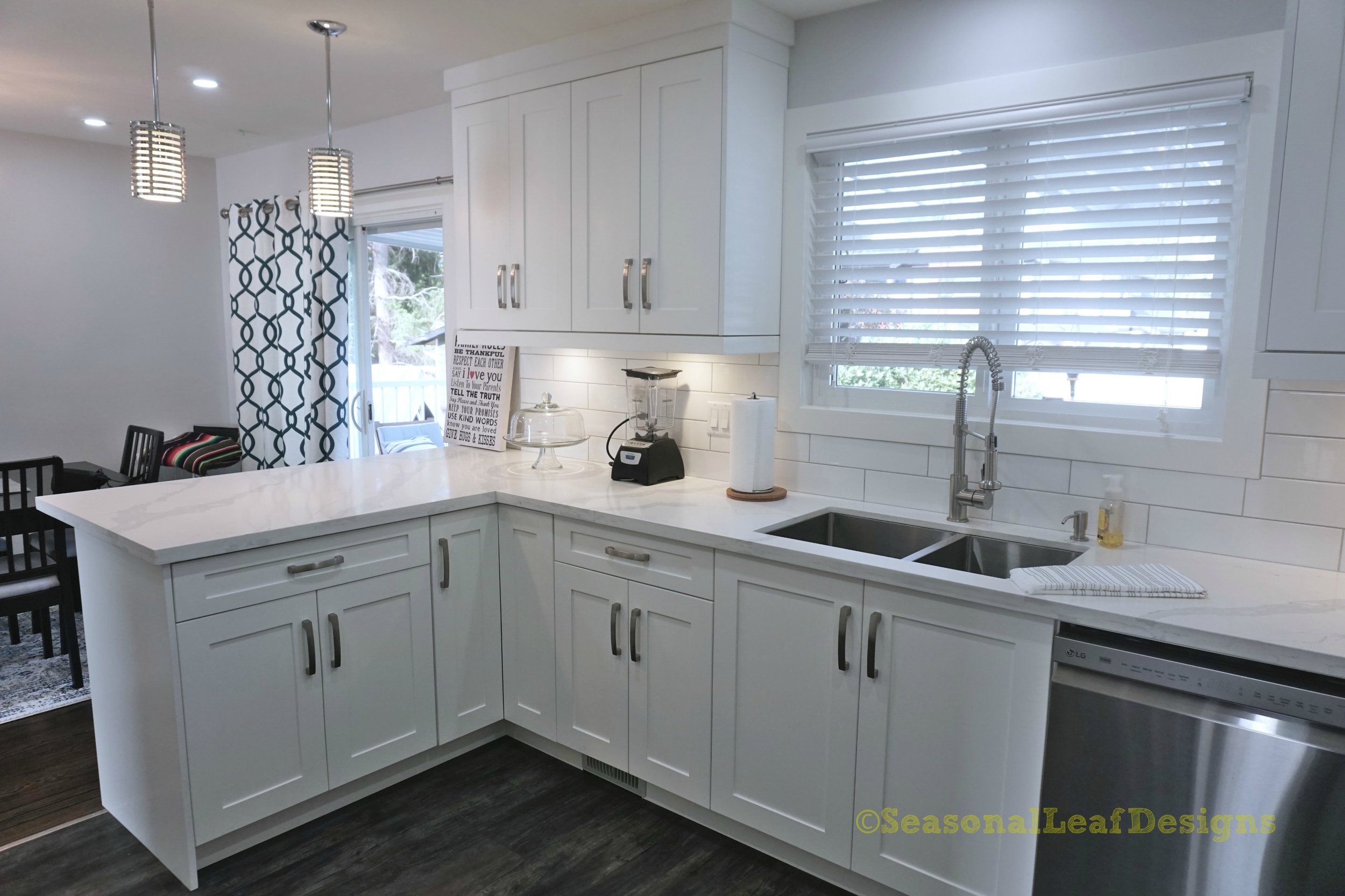
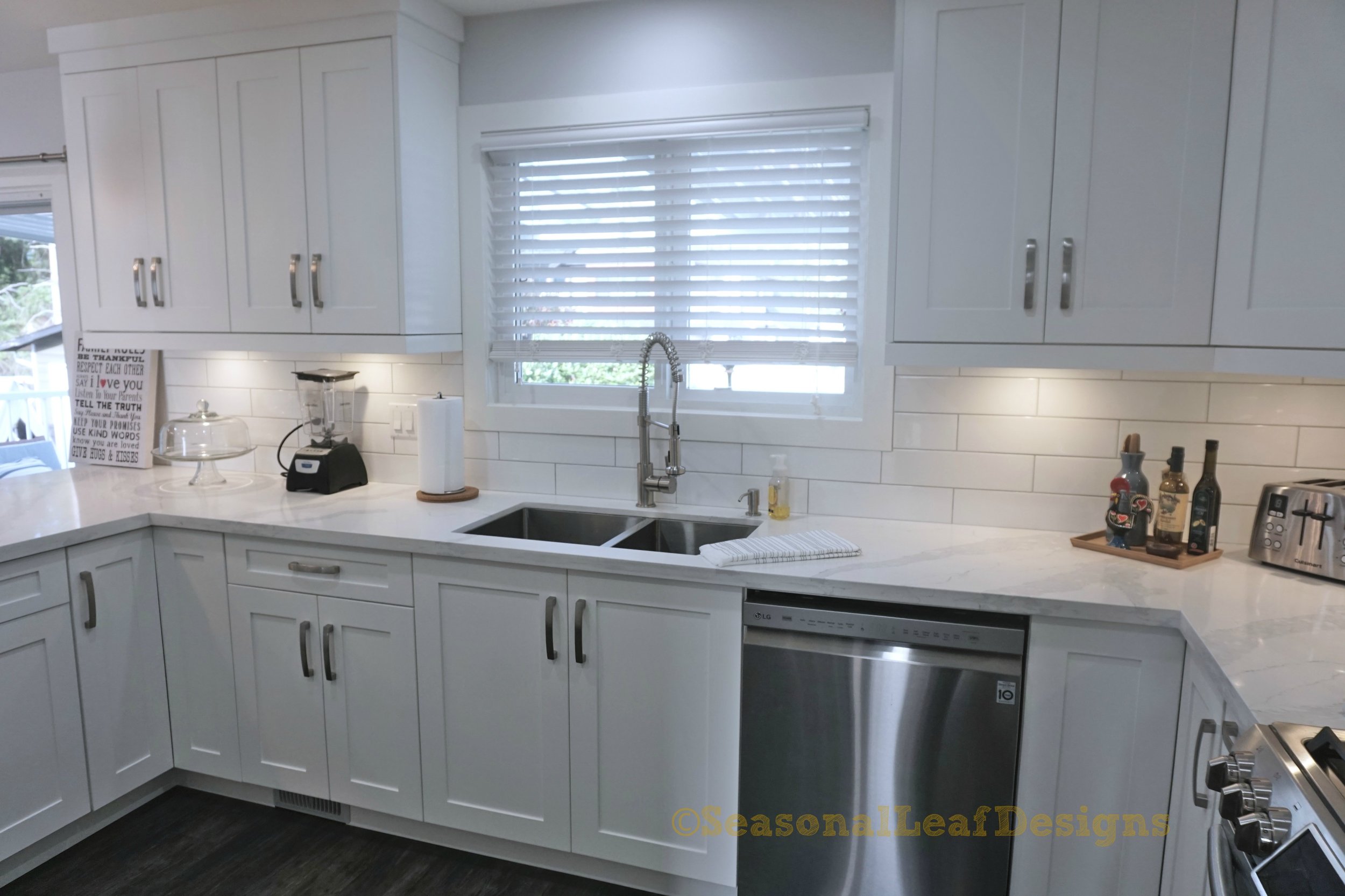
Kelvin Shaker White Kitchen
Creating a Kitchen story in white is not the most difficult thing but it is not the most easiest either. And going from a dated, dingy, closed space with tiny windows that does not allow a lot of light to a mid-century modern look with big windows, tons of light and a general airy feel can sometimes be a challenge, but always a brings a breath of fresh air. Beauty can be created through an all white palette and this pristine kitchen speaks volumes of that with its simplicity, clean lines, selected features and finishes. A new take on the longer tiles in the subway style, simple chrome hardware and faucet, clean shaker style cabinet doors and bold dark floors makes this kitchen not only appealing but also bigger and brighter.
The layout has been simple to work, along with some unique requirements to create a designated coffee station, recipe book storage, spice pullouts on either side of the cooking range, wine rack facing the dining area, ample counter space to work on and not too much glass on the doors. Main criteria was to keep the final result simple, easily accessible and easily found. We did fear that the refrigerator that was already bought might not fit in the space or may be too big but in the end everything worked out well as it does in most cases, and nothing really looked that it did not belong. It has been a very good outcome and the homeowners are not only happy but love the end result immensely!!


